As responsive design has become the new norm in web development, the trends in navigation layout have been leaning almost exclusively towards horizontal design for good and practical reasons. Due to the resizing characteristics of websites going from large desktop views to smaller mobile and tablet views, as well as case studies on how users see and interact with the primary navigation elements, the horizontal style has been winning the battle...so far.
The primary reasons for choosing horizontal design over vertical have been:
- Vertical navigation is not well suited for scaling to mobile/tablet sizes.
- Vertical navigation can become unwieldy when given a long list of navigation options that a vertical bar allows.
- Usage studies show that site visitors' interaction levels are much lower with vertical navigation compared to horizontal navigation.
With that, we can conclude that vertical navigation may never surpass its horizontal counterpart, right? Well, before we jump to that conclusion, let's explore the benefits of vertical navigation.
One of the great advantages of a world full of designers who refuse to accept concepts or trends as "final" is that, as our technology develops and as users adapt to an ever-increasing plethora of options, our paradigms for design standards constantly shift. Navigation design is no exception, and the reality is...vertical navigation is making a comeback.
Why might this be happening? I contend it has a lot to do with how users are consuming web content, whether on tablet screens with full-screen content or on larger desktop screens with a lot of visual real estate. The return of vertical navigation is more of a hybrid model that allows users to peruse a collection of content with a table of contents always at the ready to bounce the user's attention here, there, and everywhere. Flip the content up and down to view what that page offers and then, when the user is so inclined, click on the next link from the vertical menu to view a different page.
The trick with this approach is to think of vertical navigation not as a long stream of every possible link, but rather as a collection of primary entry points. One obvious advantage of this approach is that you end up with a full-screen website that works and interfaces the same on your desktop or on your tablet. By keeping your vertical navigation fixed on the left or right, you can use the entire space remaining to present your content — and make it truly a thing of beauty.
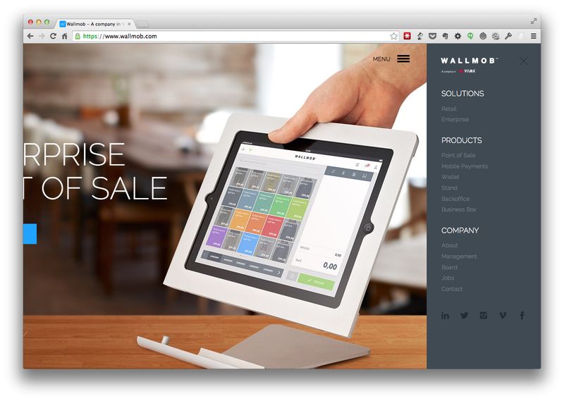
The other trend is applying the common mobile style used in responsive design (three horizontal bar images for menu pull-outs or drop-downs) for use on larger browser views. When done right, this makes the content front and center and pushes the navigation off the screen entirely but readily accessible. Just as the house icon symbolized the homepage for many years, users now intuitively read those three horizontal bars as, "This is your menu — click here to see it."
Here's an example of vertical navigation from WALLMOB, viewed with and without its vertical navigation expanded:


In these examples, you can see how the graphic elements and the content of the page are more fully and elegantly presented with the navigation menu set to the side than they would be if they were spread across the top. I do believe that determining how to best present content should inform design, so this is not a one-size-fits-all solution. But keep these thoughts about vertical vs. horizontal navigation in mind as you watch the evolution of web design and remind yourself that nothing is ever truly off-the-table if content offers the chance to rethink your usual approach.
