We're quickly approaching the end of 2016, with about three months left until we ring in the new year! Here at GRAYBOX, we always have our eye out when new design movements occur, and this blog post is a curation of the most prevalent trends that will likely continue through to the next year.
Overall Prediction: More Immersive Experiences
Users are no longer simply captivated by a beautiful photo ‚ they want to be led through an immersive digital experience when visiting a website. Following the trend I mentioned in last year's 2016 Web Design Trends blog post, we will be seeing more well-thought out and unique user experiences, with an added layer of storytelling thrown into the mix.
Prediction 1: Responsive web design is here to stay
Mobile devices are not going away anytime soon, and any website owner who has not optimized their website for mobile by now is already light-years behind their competitors. To stay current within the web sphere, this prediction isn't merely a trend, but a best practice.
Google does a great job of taking different screen sizes (and bandwidths!) into account. When first arriving on the page, the desktop experience loops a short video clip of the different national parks, giving a sneak peek into what the user is about to experience. When viewed on a phone, the user is presented with the same exact information as the desktop experience, but the interactivity has been pared back to account for limited mobile data plans, as the short video clip has been removed. Additionally, an option to change the resolution of the video is included on the desktop experience, while on mobile, this ability has been removed.
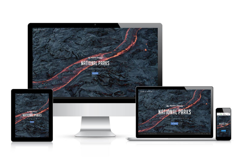
As the user dives deeper into the website, they are presented with a short introduction video that highlights the wonders of the country's national parks, with entry points to the five different parks afterwards. Personally, I was blown away by how well the video clips render across the different screen sizes - the captured view renders flawlessly on both portrait and landscape modes on mobile devices, as well as on desktop.
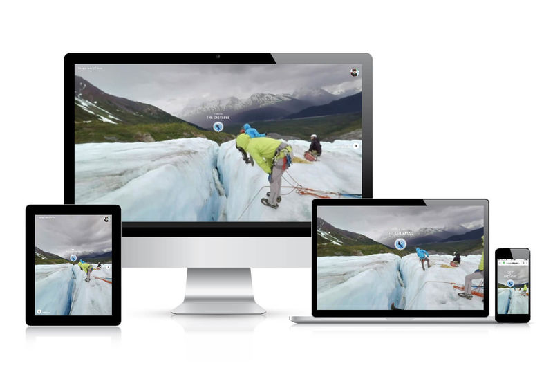
The real magic happens once the user starts exploring each national park. Take for example, the Kenai Fjords National Park. After the short introductory video clip, the user is immersed in a truly 360 degree experience across all screen sizes. On desktop, clicking and dragging the screen rotates the viewpoint, while on mobile, the user simply has to tilt and move the phone around to become engaged. I wouldn't expect less from Google!
Prediction 2: We'll see more subtle cues to indicate interactive content and keep users engaged
Conventional rollover effects that were popular circa 2012 will be experiencing a drop-off. Instead, we've recently been seeing cleverly-employed hover effects applied to imagery and buttons to indicate an element is clickable.
Take for example, Hello Monday's website. Upon arriving on the homepage, the user will quickly find out that moving their mouse cursor around directly affects the background imagery. It provides the user with a more tactile and interactive sensation, creating a more sensory-driven, interactive experience. When hovering over the up/down arrows towards the bottom right of the screen, the shape of the arrows change. Again, this provides a more tactile feeling while browsing the website. The layers of shifting content provide the illusion of depth ‚ an engaging experience as the web is a strictly two-dimensional environment (no matter how much parallax and drop shadows are sprinkled in!).
The same thing can be seen on other websites such as:
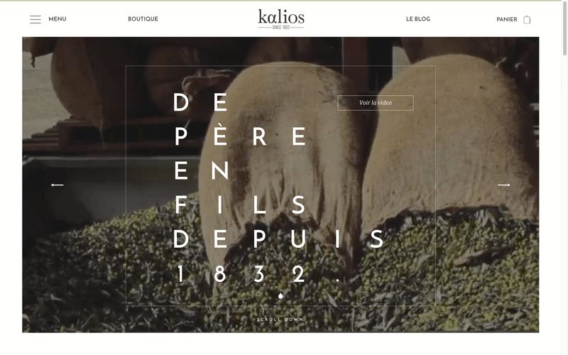
Kalios‚ The rollover effects of their buttons and products bring an added sense of "life," while on the initial homepage.
When you hover over products, they respond by moving up a bit, as if you were in the store picking them up to examine them.
The homepage's "Scroll Down" text and animation of a small oil drop invokes a sense of freshness and fun, while grabbing the user's attention to encourage exploration of the site (in this case, scrolling down).
As a product detail page loads, elements appear and shift into place in a staggered, intentional way ‚ as if a fancy waiter is setting your table with a flourish. These small touches provide extra polish and personality to their website.
Draft Design & Strategy Co.‚ Lower down on the homepage, images plus an arrow move to the right and invoke a sense of "movement" and "progression to the next page." This makes sense, as clicking on the image takes the user to a new page and elements load from left to right ‚ the same direction the image moves in upon hover. The use of the right arrow coupled with the image movement reiterate the sense of moving forward. A subtle touch, but nicely conveyed.
These subtle cues bring forth a more immersive, experiential feeling when browsing the websites above, as if the user is discovering and being rewarded with hidden gems during their encounter with these websites.
Prediction 3: Captivating media to introduce users to a website
For maximum impact, big hero images are being outshined by animated features. If you're seeking a powerful first impression, why not utilize something that truly makes a statement? Assets like animated graphics, short video clips, or animated text are compelling alternatives to the prototypical hero shot, and provide a richer and more unique experience.
Kalios does an excellent job quickly telling their brand story through a series of short clips stitched together and played on the homepage. The clips are excerpts from a longer video and capture the essence of Kalios' process of creating high-quality olive oils from start to finish, all without the need to scroll to read their promotional content! If the user chooses to navigate away from the clips and watch the entire video, a handy link at the top right is provided to view it.
Epiphany‚ This homepage introduces an added layer of creativity and personality by utilizing both text and graphic animations in their hero block. These provide clues as to what brand personality users can expect to see on the website‚ a fun and clever tone with a punch of character.
Prediction 4: Use of graphics to bring added depth and complexity to an otherwise flat, static experience
Related to the prediction above, I'm glad to see more and more websites striving to create a layered, three-dimensional-inspired experience on an otherwise flat surface.
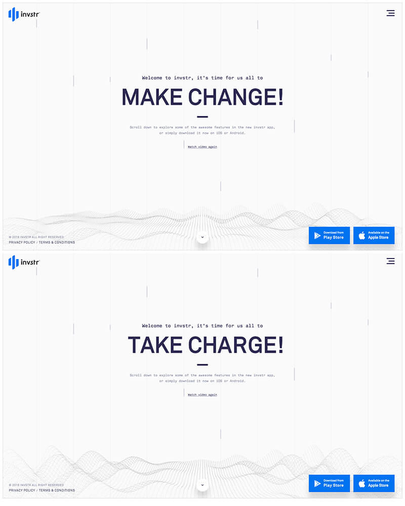
Invstr‚ Here is a great example of a company using animated graphics to draw the user into an immersive experience online. The URL directs users to a landing page which gives an artful tour of their mobile app (prediction 4), with an option to skip it if desired. Navigating past the video to the homepage is where we see a lot of interactive elements come into play. Animated text is cleverly applied to provide an interesting approach to messaging ‚ the two phrases, Take Charge and Make Change, are switched between by animating just the two characters that are different between the two phrases. A dynamic graphic akin to gentle waves or a topographical map is fixed to the bottom, adding to the overall movement of the page.
From the homepage described above, scrolling or clicking on the "Scroll Down" button automatically redirects the user to the "Features" section where users can view the various features related to the app. At the bottom of the Features page, an exciting animation encourages users to download the app.
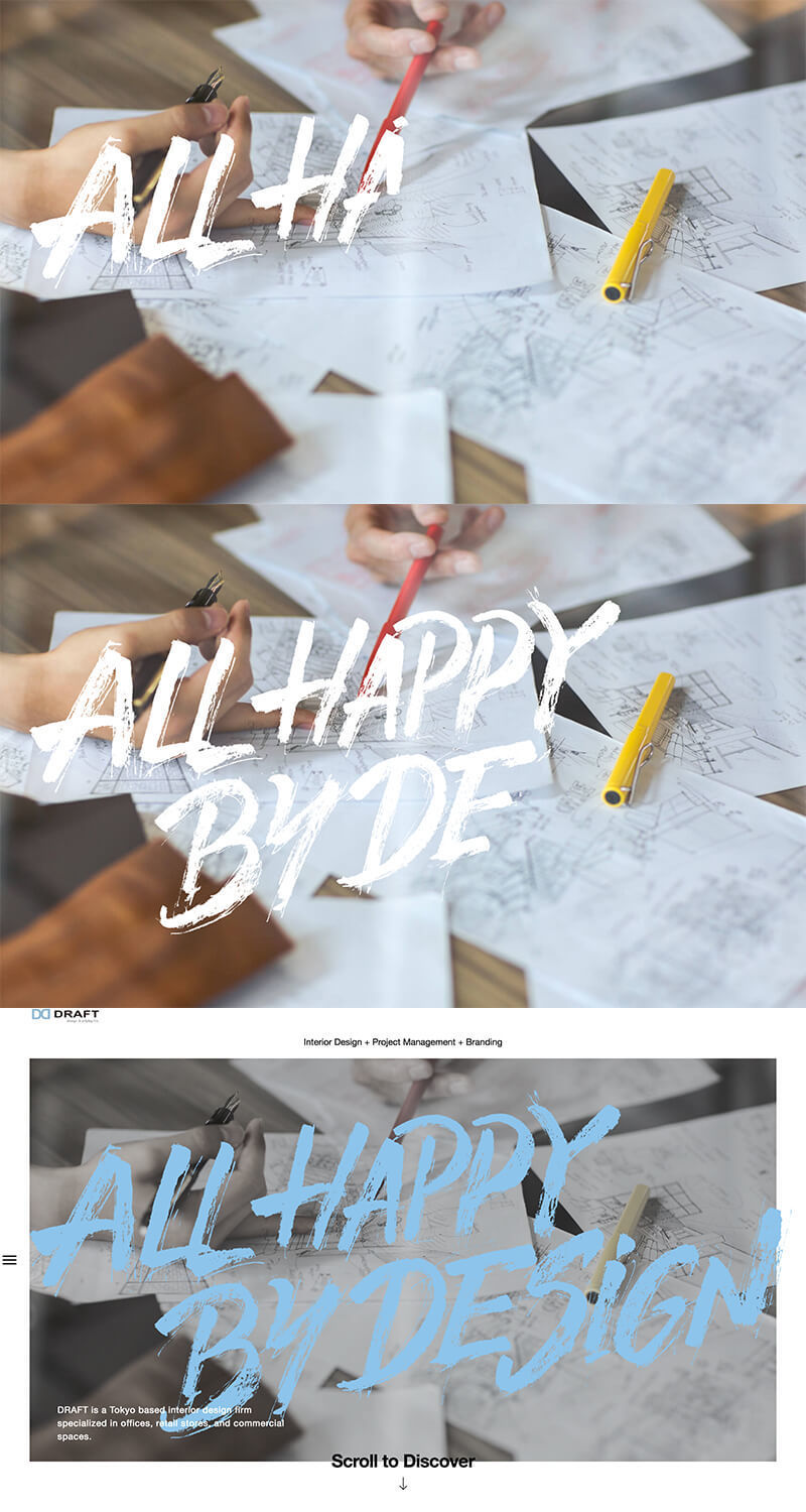
Draft ‚ This site creates movement with a different method ‚ an animated text event is applied to the handwritten subhead when both initially landing on the homepage, and then again when scrolling down the page, mimicking a live handwriting action. This subtle touch evokes a tactile and "raw" experience ‚ a nice counterpoint to the large blocks of imagery and rectangular backgrounds on the site.
Prediction 5: Refined Usage of Parallax
Tied to Prediction 5, the use of refined parallax effects are apparent as a trend that is still feeling fresh.
Parallax has come a long way since its inception. Simply put, parallax is a type of effect applied to the speed and movement of background imagery. The background of the website moves at a different speed than the rest of page, thereby mimicking layers of depth on the page. Back when it first became popular, websites were utilizing it in such bizarre ways that seizures could potentially be initiated just by scrolling down page content. As this trend has matured, we now see it applied in more refined ways.
As can be seen on Kitamura Makura's website, the website employs an interesting use of parallax when scrolling down the page to add a sense of depth to an otherwise plain, flat screen. Upon scrolling down the page, an animated timestamp appears with a person frozen behind the timestamp, presumably asleep. A moving wave pattern alludes to the brain waves a person emits while sleeping. As the user continues to scroll down the page, the timestamp changes from night to morning, while the person shifts from one position to another (mimicking tossing / turning during sleep), all the while maintaining a steady brain wave pattern. The end goal of the website is to sell a simple pillow, but Kitamura Makura's website is far from a typical ecommerce experience.

On Draft's homepage, while scrolling down, large blocks of color behind the body content slowly move at a different speed when compared to the content in front of it. The speed and transitions applied to the movement alludes to a slowly moving, yet dainty and airy element, especially considering the size of the block that is moving (large flat rectangle). This is another example of sophisticated parallax creating an immersive user experience for the visitor.
Prediction 6: Pushing to Break Out of Conventional Grid Format
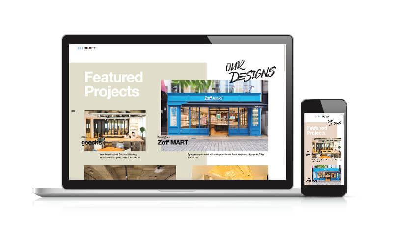
As more websites are catching up to implement responsive web design, we see a lot of repetitive patterns appearing when downsizing from desktop to mobile. It's refreshing to see websites that challenge the emerging status quo, such as Hello Monday or Draft Design & Strategy, who use the responsive format in an unconventional way. The websites are definitely implementing a grid structure as a foundation, but as the transition from desktop to mobile occurs, elements shift/shrink in a thoughtful manner, alluding to the great care and foresight the designers and developers had when transitioning through the different breakpoints.
SMALLER ASSET-DRIVEN TRENDS
Relieving interstitial anxiety through the use of animations / loader graphics
As designers start employing more fancy animations, videos, and other elements that add load-time to a website, a good solution to alleviate the build-up of interstitial anxiety. Interstitial anxiety is the temporary state of suspense a user experiences between an initiated action (clicking a link to a designer's hefty portfolio site) and its response (site load).
Cross Me, a Japanese online dating website, uses a clever loader graphic - two separate colored circles on either end of the screen slide towards the middle until they meet to form one circle. A percentage to completion is also added to provided further context. This simple, yet clever animation alludes to what the website's main intent is ‚ matchmaking.
To help relieve interstitial anxiety, Hello Monday employs a simple text message that counts down until the page is completely loaded.
Draft also employs a page load animation ‚ a simple rectangle with an animation applied to imply progress.
Again, these graphics are a small, subtle touch. However, without utilizing forewarning messages such as these, the user may think the site is broken or built poorly simply due to it loading slowly, thereby diminishing or even breaking their feelings of trust and reliability towards the site. Can you imagine how many client leads could potentially be lost for Hello Monday or Draft without the use of this loader graphic? Potential repercussions can be that severe!
"Scroll Down" Notification
One of the biggest usability concerns with a full-screen web experience is that users will miss out on content "below the fold." As mentioned in an earlier blog post, I encourage you to reference the article "The Myth of the Page Fold: Evidence From User Testing" by Joe Leech from CX Partners UK regarding this. As more people gain access to the web, the more they become accustomed to the concept that a web page is not a static screen, but a dynamic page that can indeed be scrolled through. Still, to accommodate for less tech-savvy users, many websites like Kalios, Hello Monday, Epiphany, Susa Adventures, and Draft employ some form of a notification to indicate important content exists below the fold, aiding in usability for less advanced web users.
Fixed Nav
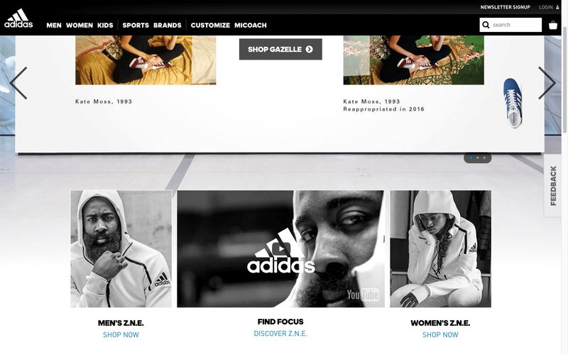
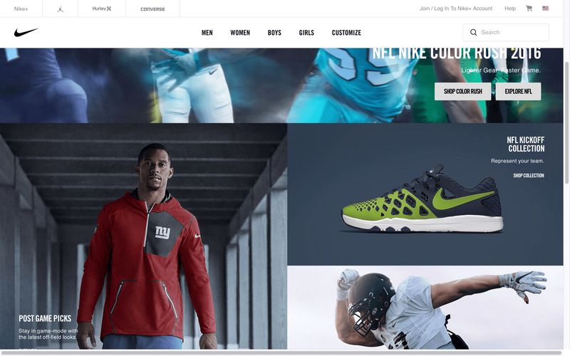
I'm glad this trend is becoming more popular, and it's interesting to see how different websites employ the use of fixed navigation. Big names like Nike, Adidas, Pinterest, and Facebook all employ the use of this, which leads mass market non-savvy web users to become familiarized with this design feature. Almost all of the websites mentioned above also employ the use of a fixed nav, with some websites even going so far as to hide menu items by default within a menu ("hamburger") button. The jury is still out whether or not this is a good UX practice for all digital experiences, especially when applied to desktop experiences, but as more users engage with the web on their mobile devices, they become familiarized with the invokable menu through the use of the menu button.
Diffused Drop Shadows
There has been a particular trend occurring lately regarding the application of drop shadows on elements. Typically this visual effect is paired with flat graphics (but it can also be applied to images) this type of drop shadow mimics a more diffused look rather than the typical drop shadows used in previous years. To find more information on how to make your own diffused drop shadow, take a gander at this how-to post on the Invision App's blog.
As always, we at GRAYBOX are eager to see what new trends, experiences, and movements 2017 will bring for us, and what trends will fade out within the next year and beyond!
If you're interested in refreshing your organization's digital experience, we'd love to chat about what you have in mind and see how we can help. Also, if you're a designer or developer looking to join a forward-thinking firm, we're always looking for good people‚ give us a shout.
