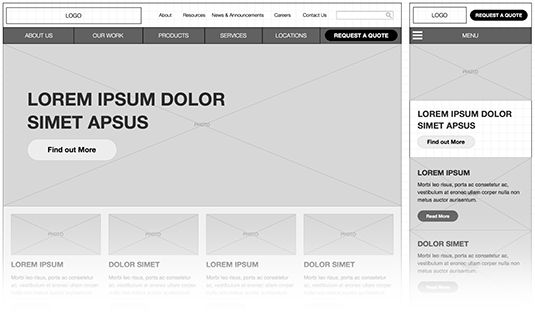
Here at GRAYBOX, virtually every new site we design includes responsive features. Designing for multiple devices can be tricky. We refine our responsive design process constantly to identify and fix issues we come across with each site we build. Here are three important things we've learned.
1. Side-by-side design
Every device is different. What's good for one viewport isn't necessarily good for the other. It's important to think critically from the very beginning about how users will interact with your site on a laptop, tablet, or mobile phone. Designing the desktop view and mobile view at the same time can help iron out any issues before they become a headache when you get into coding.

Look at both designs side by side and ask yourself if your design choices make sense. Will your complex navigation bar collapse into a dropdown menu? Are you hiding important content on mobile? Is everything just too complex, and should you just scrap it all and start designing again from scratch? Making these choices early saves time, meets budgets, and reduces stress for programmers.
2. Use things others have built
There are several really great tools and frameworks for designing and building responsive sites. "Zurb Foundation and Twitter Bootstrap are two very popular frameworks with components pre-built to scale to mobile. There are even several OmniGraffle stencils available that are based on these frameworks to help in the wireframing process. Using tools and components that others have built can help you be more efficient by not re-inventing the wheel, leaving you more time to focus on more complex issues.
3. Design and experiment in-browser
Illustrating a design concept in OmniGraffle or Photoshop can help set a vision for a site, but often it's hard to actually reproduce how a site will feel to a user. Sometimes the only way to experience a site design is to actually design the site in your browser. One way to do this is to quickly build prototypes of your wireframes and click through them in a browser. This doesn't necessarily mean building the entire site out, perhaps just a particular widget or page template. This way you can actually test each decision you make before you've gotten final approval on a specific piece of functionality you've designed in your wireframes. Knowing that a choice you've made works is much better than assuming it will.
These tips are just a few things we've learned recently when designing responsive sites. If you have any tips you'd like to share, feel free to leave us a comment below!
