As a Web Designer, I come across a myriad of sites every day. I see exceptional, great and downright bad web design practices, and even trends that spring up every now and then. Below is a small list of web trends I've encountered frequently that benefit the web community as a whole.
Scrolling Pages Finally Get Some Love
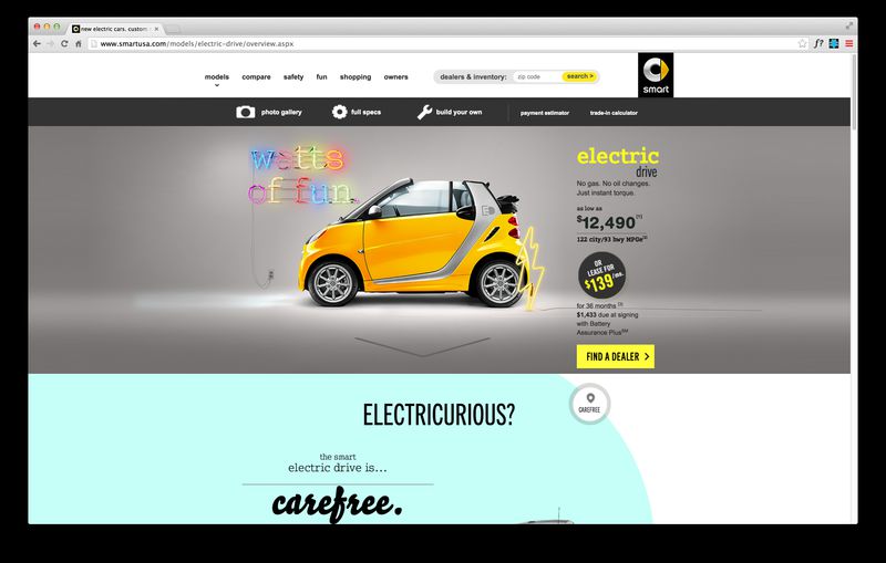
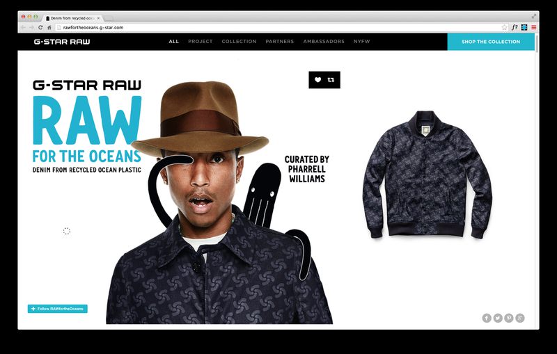
Often times as a designer, clients ask me if users scroll. Time and time again, I reference the article "The Myth of the Page Fold: Evidence From User Testing" by Joe Leech from cxpartners.co.uk regarding this. They get nervous that the content towards the bottom of the page won't get enough attention and request for what seems like "all important content" to be placed above the fold. Thanks to designers and developers alike, we can finally quell client fury and banish these evil thoughts! Countless sites, like Smart USA and clothing outfitter G-Star Raw use long scrolling pages well, proving that "below-the-fold" content is just as important as "above-fold" content.
Smart USA
G-Star Raw
Fixed Nav - Not Just a Fad
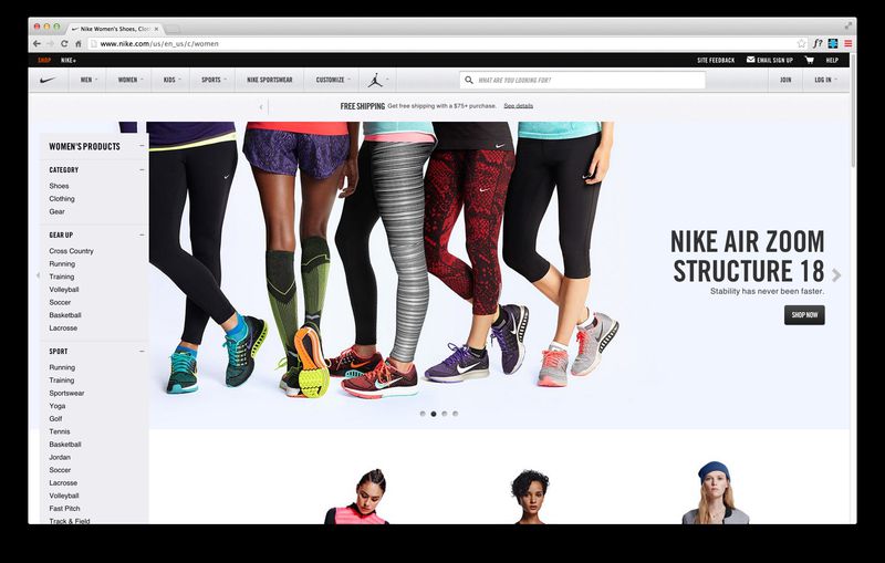
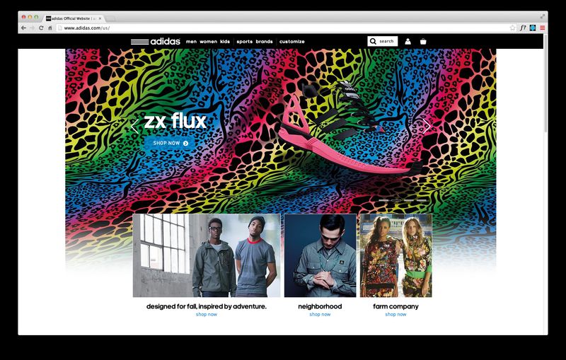
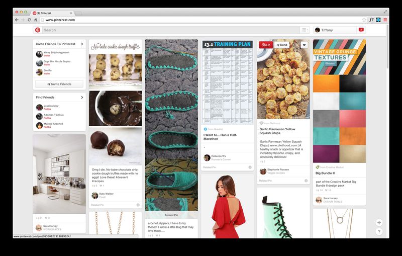
What makes long scrolling truly effective is fixed navigation. Let's take a look at name brands Nike and Adidas, whose behemoths of a website are easy to navigate with the aid of a fixed nav element. The content provided on their pages can get quite lengthy in some instances, but with the help of the fixed nav element, users can quickly access content from other pages if need be without the bother of scrolling up to the top of the page or down to the footer. Another great example is Pinterest's website. The website's main objective is purely for content absorption while getting lost in the myriad of photos that blaze through, scroll upon scroll. Power-users who browse through the website can easily access the search / browse features quickly at a moment's notice. Pinterest also has a unique example of using fixed nav elements at the bottom of the page, where users can manage their pins, create boards or get help from the buttons provided. All of this creates for an unobtrusive user experience where content shines through clearly and navigation elements provide support when needed.
Nike
Adidas
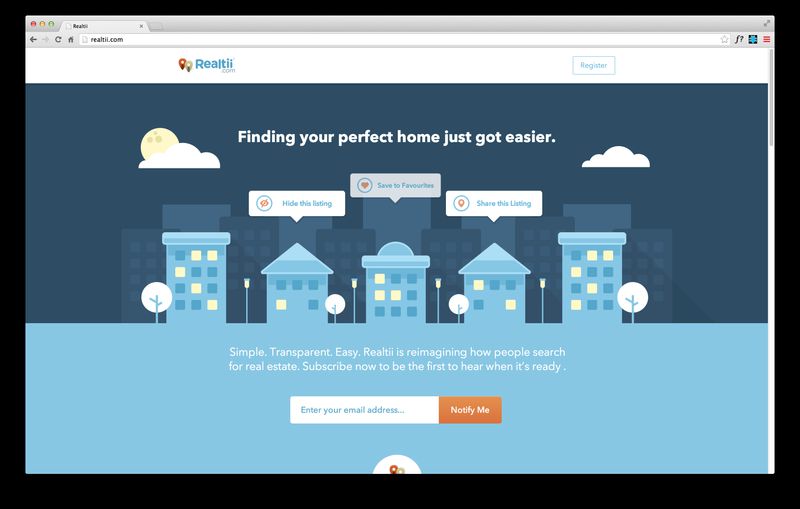
Flat UI with Subtle Shading/Gradients
It has been around for a while now, and with tech titians Apple, Google and Microsoft leading the trends for flat design, we don't see this stopping anytime soon. We maintain a flat quality of even the smallest of icons, but designers are sneaky enough to incorporate some form of depth into their designs by utilizing subtle shading to replicate depth and shadows. The use of overlapping elements also helps in conveying depth and perspective to users. Check out Realtii for their nice hero image. The use of long shadows for the buildings and overlapping objects like trees and apartments provide depth and perspective to an otherwise flat-design landscape.
Realtii
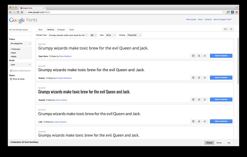
Free Web Fonts via Google Fonts
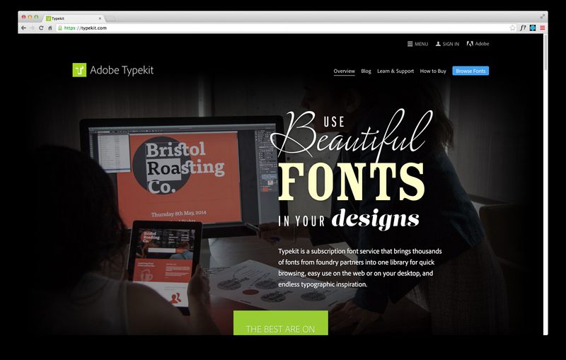
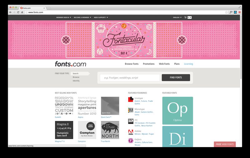
A few years ago, web fonts were limited to simple css tags of serif and sans serif with a few default fonts provided by operating systems and web browsers (Georgia or Verdana to name a few). Gone are those days! With Google Fonts providing a diverse and wide array of (free!) web fonts, even the humblest of websites can add a punch of personality by integrating these web fonts. Additionally, one can also rely on Adobe Typekit, Fonts.com, and the like if you want to broaden your web font selection for a fee.
Google Fonts
Adobe Typekit
Fonts.com
Meaningful Hero Image Replaces Banner Content
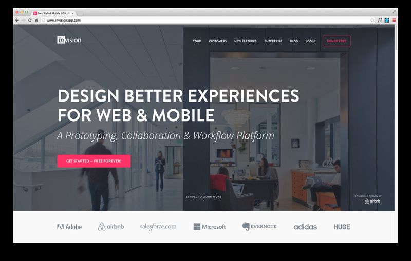
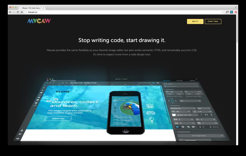
It has been proven time and time again how ineffective carousels are. There has even been a mini website created referencing all of the research proving so! Fortunately, there has been a shift in thinking regarding this. Designers are increasingly replacing these often-ignored carousel sliders with more meaningful, actionable content. Invision, a prototyping web app, has a very clear and concise headline with an equally clear CTA in which users can quickly and easily sign up for the service. Macaw, a web design tool built of both designers and developers, is also a great example of using a powerful hero image supported by meaningful text. It also integrates a fixed nav and long scrolling page to explain at length about their product.
Invision
Macaw
Mobile, Mobile, Mobile
The idea of mobile-first has really been out there for a while now, but what we forget sometimes when designing for mobile is the fact that the web's reach is global, now more than ever. Users found in emerging markets (like China, Russia, India, or Brazil) are influencing global web traffic more than ever. Because of this sense of global engagement, we must be:
- Aware that a rigid standard of screen sizes alone will not be a sufficient way in determining which experience to deliver to a user. Since a lot of countries have their own unique mobile device market, and each market has a wide range of various screen sizes, we as designers must think fluidly.
- We must also be aware of connectivity, especially in countries with erratic data service. Have your website's images optimized for web, strip down your code so it is clean and efficient, and use other best practices to ease in expenditure of website data.
Videos Replace Images
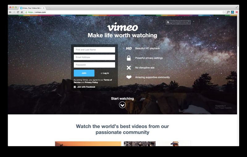
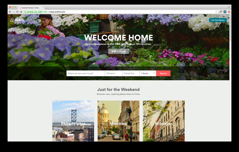
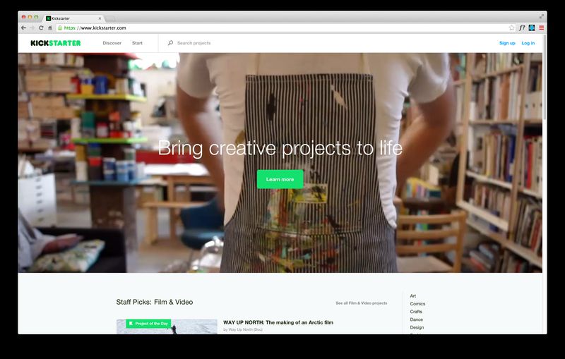
Ever heard of "a picture speaks a thousand words?" Now imagine what a video can do! More and more of the web population has access to better internet speeds and connections, which opens up a new world of using video as the new hero image or banner. This goes hand in hand with utilizing video as background imagery. Vimeo is a great example of this and aptly so for the video-sharing website. Airbnb is another great example employing the use of video backgrounds, giving a sense of emotion to the accommodation-booking website. Kickstarter is yet another example, employing a video as both a background image and hero area, with supporting text/buttons to learn more about their website and how to set up a Kickstarter.
Vimeo
Airbnb
Kickstarter
Landing Pages
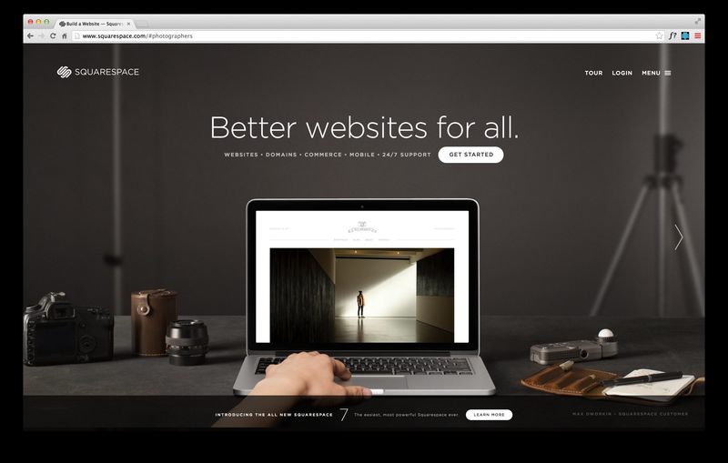
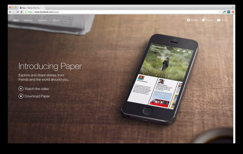
Sometimes, a simple landing page can beat out a full website. Squarespace is a great example. Its main CTA is for users to sign up for their website-building service or walk through a tour, while existing users can simply login to manage their websites. Users also have the ability to navigate to other sections of the landing page by using horizontal scrolling. This isa unique way for users to scroll through the website's various sections, rather than a more conventional vertical-scroll approach. Additionally, quite a few mobile apps employ the use of a landing page for their promotional website. Facebook Paper is an example. With the use of minimal text-based content for their website, they took the liberty of incorporating video backgrounds on their landing page to tell their story. They also took the approach of going with a horizontal-scrolling type of navigation.
Squarespace
Facebook Paper
Conclusion
The trends listed above are but a few examples of an overall shift in the web space. Better/faster connections lend to new and improved ways of telling a brand's story and a broader range of screen sizes remind us to think fluidly. 2015 is slowly creeping up and it will be interesting to see what new trends pop up and what old trends will pass on.
