Happy Belated Birthday Mr. Wassily Kandinsky!
I've sat through numerous art history classes during my years of schooling. Every single time one of Kandinsky's paintings appeared on the screen, it instantly captured my attention. The glow of the screen projector made the colors pop. His style is so distinct and characteristic of the era.
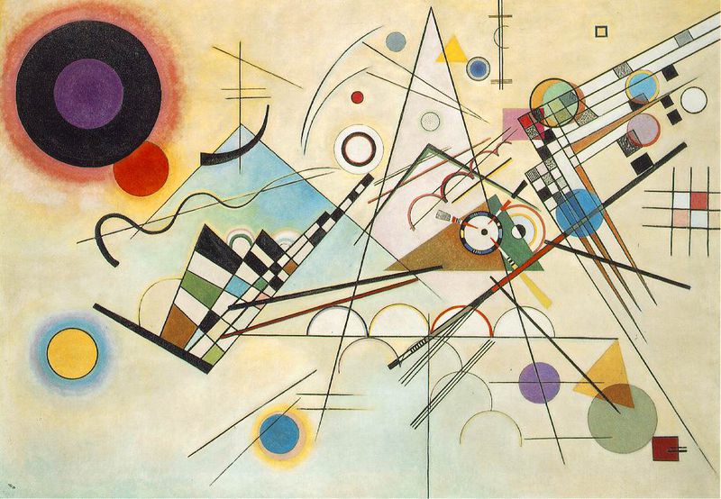
Kandinsky was a master of the Gestalt principles, whether he himself realized it or not. He knew how to harness the power of the principles to create an art piece that truly sang to me, as if notes from a sheet of music were somehow translated into geometric lines, shapes, and forms onto canvas. His work is timeless, and I think all designers can learn to better themselves by simply digging a little deeper into Kandinsky's work and processes.
Earlier I mentioned the Gestalt Principles. "What is gestalt?" you may ask. By definition, it can be translated from German to mean "shape" or "form." In theory, Gestalt is a term most commonly used in psychology that means "unified whole." You may have heard of the phrase, "the whole is more than the sum of its parts." For a while, this theory perplexed me, until I learned more about the Gestalt theory.
It was first introduced in a ground-breaking paper by Max Wertheimer in 1923, an Austro-Hungarian-born psychologist, and was further developed by German psychologists Wolfgang Kohler, Kurt Koffka, and others.
The Gestalt theory can spark new light when it comes to design. It helps us to think about our compositions in ways that we have not imagined them before. In fact, many principles that come from the Gestalt theory can be applied to all forms of art and design, from painting to photography, digital design to architecture, and good old fashioned print design.
As consumers of various user interfaces (UIs) on a day-to-day basis, we tend to view these UIs as a whole before we see the individual elements that make up the entire interface. Below are the various principles the Gestalt theory covers. All of these principles can be summarized in a few sentences, but the detailed theory behind them can be explored endlessly, should you desire to do so. Let this be a brief introduction to greater understanding.
Figure/Ground
Our eyes try to differentiate an object from its surrounding area. If you think about it, it's an evolutionary advantage. When we were surviving on the plains of Africa, our vision helped us to spot potential prey or to narrowly escape our potential predators.
A form, silhouette, or shape is inherently perceived as figure (object), while the area surrounding it is perceived as ground (background). We have a tendency to see the figure as positioned in the front, and the ground at a further depth plane that continues to extend behind the figure. The classic Rubin vase illusion of face profiles versus a vase is a great example of figure vs ground. What do you see first? To some, it may seem like an ordinary vase. To others, it may be two faces facing each other over a gray background.

Another great example of figure vs ground is the illustration below. Do you see a silhouette of a tree, or a gorilla and lion facing each other?

The two examples above leave us with a sense of confusion, as we are not sure which item is figure and which is ground. When users are looking at designs, one of the first things they will do is determine what elements are figure and what is ground. This is mostly a subconscious thought, unless a designer is purposely trying to create a juxtaposition between the two. The easier it is for a user to distinguish between what elements are figure and what elements are ground, the better their user experience, as the elements are not creating unwanted noise or confusion within a design.
Area & Convexity
Area and Convexity can further define the differences between figure and ground.
In the principle of area, the smaller of two overlapping objects is commonly interpreted as figure, while the larger object is interpreted as ground.
In the principle of convexity, convex patterns tend to be perceived as figures more than concave patterns.
Similarity
With the principle of similarity, elements that share similar characteristics are perceived as more related than elements that do not share those characteristics. This statement sounds obvious, but it can be manipulated in various ways.
Characteristics that can be potentially manipulated are:
- size
- shape
- color
- texture
- transparency
- direction
- etc.
When viewing a group of objects, elements sharing the same characteristics as mentioned above are perceived as being related.

One example of similarity when applied to web design is the usage of link colors. Usually, links are styled differently from the rest of the content, but each are styled similarly. The old standard used to be blue, underlined text, but that has since changed to accommodate unique styling based on a design. The rule here is to keep link and button styles consistent. Users not only consume a website's or app's content, but they also learn how to navigate through it based on visual cues. If a link color is blue on one page, but orange on another, users will have trouble differentiating what text type is a link versus an accent color, highlighted text, and the like.
Focal Points
Conversely, when similarity does occur, an object can be emphasized further if it is dissimilar to other objects. This is called an anomaly, or focal point, of a set of elements. These elements can hold the viewer's attention. Naturally, our brains are wired to spot patterns, and if an element contrasts from the rest of the surrounding elements, we quickly become aware of it. This goes back to ancient humans spotting potential prey or predators back on the plains of Africa where quickly identifying a contrasting element from its surrounding environment, no matter how subtle it may be, can be the difference between eating or being eaten.

Law of Pragnanz
Roughly translated, this means Law of orderliness or simplicity. As human beings, we prefer things that are simple, ordered, and uncluttered. We attempt to perceive complex or anomalous shapes into the most simplest forms possible for ourselves. Take for example, the object below. You can probably make out a square, circle, and triangle from this form, but by itself, it is ambiguous in shape.

Closure
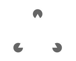
Closure occurs when an object is incomplete or not entirely enclosed. Our brains attempt to fill in the gaps if enough information is provided to us. Again, this is our human instinct, as we try to simplify what we see into the most basic shapes or forms. By doing so, we can process what we see easier and faster without overcomplicating ourselves.
Like Pragnanz, this law yearns for simplicity. Unlike Pragnanz, however, instead of separating and interpreting different shapes from one large form, we do the opposite; we combine different parts to form a whole. Take for example, the three circles with triangle cutouts in each one. For most people, we see a white triangle overlaying the three circles at its points. Another example is the panda figure, also below. We attempt to close the white gaps to process the image in our minds. By combining different shapes to form a single shape, we simplify a figure, gaining clarity and understanding.

Continuation
With the law of continuation, we prefer to see continuous, unbroken paths and curves. Our eyes move through one object and continue to follow its intended path. Elements arranged in a line or curve are typically perceived as being related to each other, even if we attempt to apply other Gestalt laws with it. If we see the example below, these two lines intersect. Here, the law of Similarity (green color) is actually weaker than the law of Continuation (following a path), as we try to view this green and gray path as a horizontal line, rather than an angled green line and angled gray line.

Uniform Connectedness
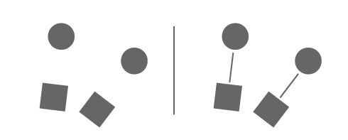
With the law of unity, elements that have a visual connection are perceived as related, whereas elements with no connection are not related.
In the figure below, we see 2 sets of a circle and square connected by a line, rather than a pair of each form. Note that lines do not necessarily have to touch other objects to form a connection; they can simply point to an object to imply one.
Common Regions
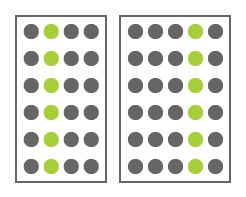
Uniform connectedness can also refer to a relation of elements that are defined by enclosing elements within other elements, regions, or defined areas. In the figure below, we see two separate sets of circles, even though they may share the same shape and color. Because of the enclosure, we no longer pair the green circles together, but rather, as their own separate entities within each enclosed region.
In design, the use of borders around a group of elements is a great way to create a distinct separation from other elements near it.
Proximity
The Law of Proximity states that elements that are close to each other are perceived as a related group than elements that lie farther apart. If you take a look at the illustration below, the one on the left has circles placed without proximity. All of the circles are perceived as their own separate shape. The illustration on the right has grouped the circles into a uniformed block. Because of this grouping, they are now perceived as one group rather than individual shapes. This law is similar to the law of Common Regions, but instead employs the use of space rather than enclosure to separate elements from one another.

1 + 1 = 3 effect
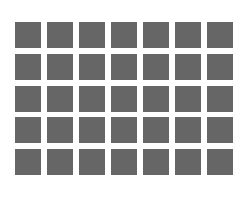
Typically, we think of white space as a background element, but when manipulated, it can become an active visual element. An example is the 1 + 1 = 3 effect. When elements are placed closely together, the white space between the objects transforms into its own individual element, becoming visually active as the elements move closer together. We've seen an example of a grid of squares and the optical illusion of seeing gray dots in between the corners of the grid. We can avoid amplification of this noise by being mindful of how we place elements on our mockups and how much space we give between elements.
Symmetry
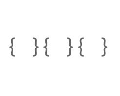
By and large, human beings are more or less symmetrical. We have a pair of eyes, ears, legs, arms, hands, feet, etc. It is in our nature to attempt to perceive objects as having some form of symmetry. Below, we see a group of brackets. Rather than perceiving them as an individual group of open brackets and an individual group of closed brackets, we see them as three pairs of open and closed brackets. Here, symmetry trumps similarity. Also with this example, symmetry trumps proximity, as we view an open and closed bracket pairing, rather than two sets of closed and open brackets with lone brackets on either side of them.
Common Fate (Synchrony)
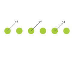
With the Law of Common Fate, elements that move in the same direction are perceived as being more related than elements that are stationary or that move in different directions. Elements that change at the same time are also grouped together. Regardless of their shape, color, etc., elements that are seen as moving or changing together will be perceived as being related.
Parallelism
Elements that are parallel to each other are seen as more related than elements that are not parallel to each other. Lines are often interpreted as leading, pointing, or moving in some direction. Parallel lines pointing or moving in the same direction are perceived as being related because of this same directional movement.

Past Experiences
The Law of Past Experiences is a tricky law to employ, as it is highly subjective based upon an individual. It is perceived that elements that are shared within our past are known as being related. For example, a red, yellow, and green light in a row or column tends to convey to many as a stop light. We perceive red as stop, yellow as slow down/stop, and green as go. Because of our past experience, we may assume that many others will understand the same thing.

The same can be true for language. We perceive a pattern of strokes that are grouped to form characters or letters, which are then understood as words that form sentences. This is universal across all languages (provided that you understand the language in which you reference). Note that this arrangement of characters may not be familiar if observers lack such past experiences with the characters (people that view the word dog with no understanding of English will not know what this word conveys).
With this example, the law of proximity goes hand in hand with the law of past experiences. By inserting blank space characters between words, our eyes group together the letters correctly, thereby establishing words as the most recognizable visual units in text, rather than individual letters. Compare this to the style of writing —scriptio continua— for example. We can quickly see the importance of this when we removealloftheblankspacesfromthetextprovided or pl acet heb lanks pacesi nune xpect edo rw rong pla ces.
Summary
We've only begun to scratch the surface of the Gestalt principles.
The principles help us to design mindfully, questioning whether or not an element is truly needed or simply unnecessary. Grouping of elements, layouts of a page or screen, size and colors of images, text blocks, and/or shapes are all dictated by these principles. Even emotions can be triggered through the use of these principles. Simply browse through Kandinsky's paintings and one can quickly see the musicality of his works.
If you can harness the power of these principles in such a way to become a master at them, then you will become a master at visually communicating your designs to others in ways that words simply cannot achieve.
Below is a list of resources that brought this blog post to life. Thank you to all who have helped contribute to them.
http://www.vanseodesign.com/web-design/gestalt-principles-of-perception/
http://webstyleguide.com/wsg3/7-page-design/4-visual-design-principles.html
http://www.scholarpedia.org/article/Gestalt_principles
http://graphicdesign.spokanefalls.edu/tutorials/process/gestaltprinciples/gestaltprinc.htm
https://www.interaction-design.org/encyclopedia/gestalt_principles_of_form_perception.html
