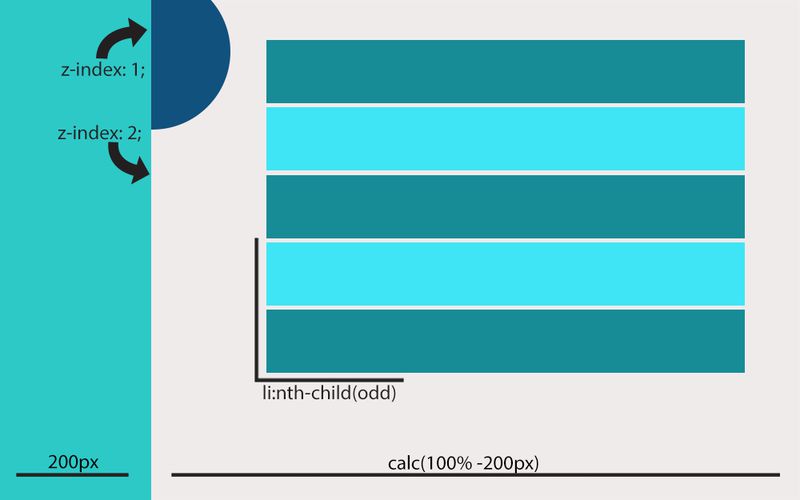
Positioning elements in a fluid and responsive manner can be tricky business. In this post we'll go over three CSS components that help make positioning elements a breeze.
First up is calc(), a handy component that allows you to do basic math in order to calculate the width of elements. The best thing about calc(), and really what makes it useful, is that you can mix and match units of measurement. Let's say we want to have a side panel with a fixed width of 200pixels, and we want the rest of the content to be in a division at 100% of the rest of the screen. A word of warning: Calc() is a new feature of CSS3 and may not be supported by older browsers. Here's an example:
.sideNav { width: 200px; } .container { width: calc(100% - 200px); position: relative; left: -200px; }Second we have z-index, an essential feature that lets you stack elements on top of each other in a civil manner. When you put elements at different z-indexes, it separates them into different plains, so an element at 90 won't interact with an element at 40. Something to note is that z-index only works on positioned elements, i.e. position: relative, like this:
.backBlock{ position: relative; z-index: 100; } .frontBlock{ position: relative; z-index: 200; }Finally we have nth-child, which is a very useful because it lets you select elements based on their positions within their parent element. This means that you can do cool things like apply a CSS background to every other element. A word of warning, though, this feature is not supported in IE, so make sure your page doesn't break without it. Here is an example that adds a margin of 50 pixels to the top of every other element:
li:nth-child(odd){ margin-top: 50px; }We'll wrap up with a graphic showcasing an example of potential visual effects as a result of these three CSS components.

